Shipmap.org turns AIS exhaust into a clear view of global shipping and emissions
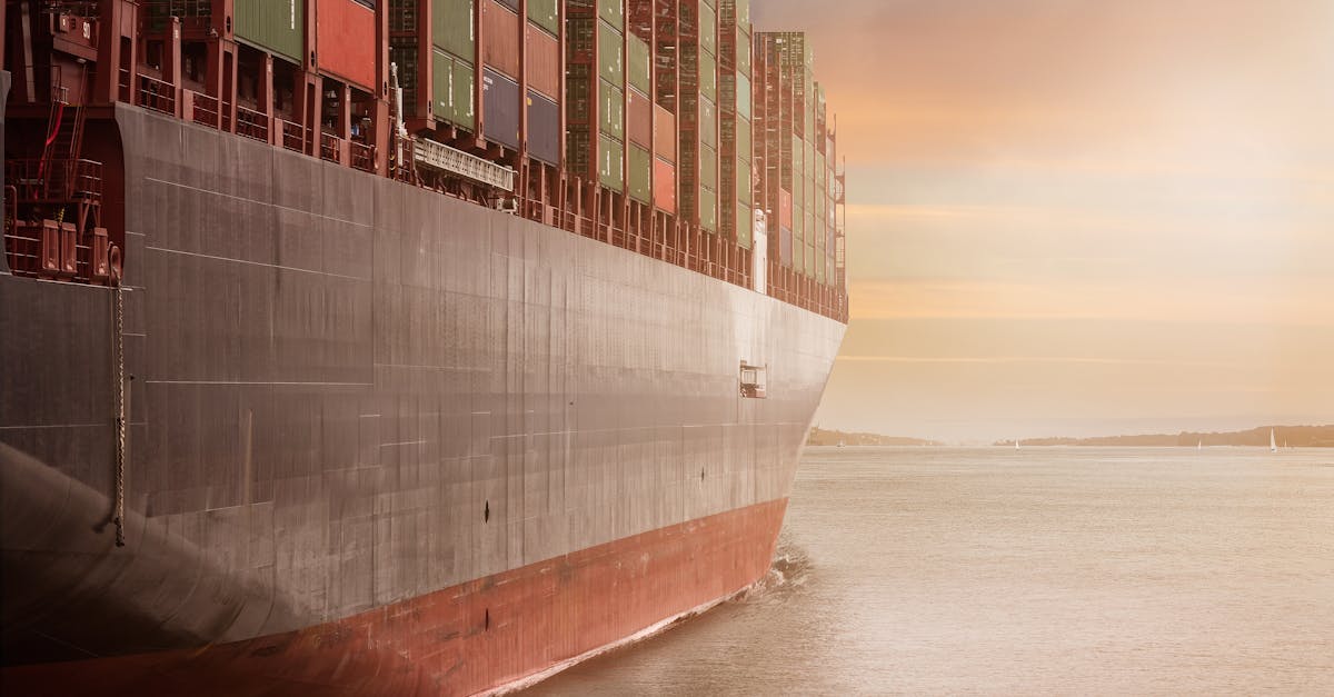
Shipmap.org is a browser-based, explorable map of global merchant traffic built by Kiln with the UCL Energy Institute, using 2012 AIS records to trace cargo, tanker, bulk, and gas carrier movements and estimate associated CO₂. Under the hood, it aggregates millions of vessel position reports into animated flows and density layers, with filters for ship class and views that tie route intensity to emissions. What’s notable here is the pairing of motion and impact: you can see lanes light up and immediately connect that activity to where fuel burn and pollution concentrate.
The bigger picture is a template for turning industrial telemetry into legible narratives without dumbing down the data. For developers, it’s a case study in compressing large geospatial time series for the web and using careful defaults to keep interaction snappy. For industry watchers, it offers a lucid snapshot of chokepoints, port dependencies, and how different fleets shape the map. Worth noting: this is a historical dataset, not a live feed, and it isn’t a full analytics console. But as a calibrated, public-facing baseline-and a design pattern for communicating AIS-derived insights-it still sets a high bar for clarity and context.